 EN
 AR
 BG
 HR
 CS
 DA
 NL
 FI
 FR
 DE
 EL
 HI
 IT
 JA
 KO
 NO
 PL
 PT
 RO
 RU
 ES
 SV
 TL
 ID
 LV
 LT
 SR
 SK
 SL
 UK
 HU
 MT
 TR
 AF
 MS
 GA
 IS
 MK
 HY
 KA


PVC Luggage Tag Design Ideas: Combining Style With Function
A luggage tag is a small product with two important responsibilities: it should help identify a bag, and it should be easy to recognize while traveling.
PVC offers designers a flexible visual language for achieving both goals. Its surface can feature solid colors, raised lettering, recessed details, graphic illustrations and distinctive shapes. A well-designed PVC luggage tag can function as a travel accessory, brand object and visual identifier at the same time.
The examples in this article demonstrate several design directions—from a simple smile graphic to dimensional typography, modular travel illustrations and shape-based collections.
1. Start With One Clear Visual Idea
The most memorable luggage tags usually begin with one strong concept rather than several unrelated decorative elements.
A simple concept may be:
- A recognizable face or expression
- A brand symbol
- A destination
- A sport or activity
- A travel-related object
- A bold word or short phrase
- A color associated with a group or event
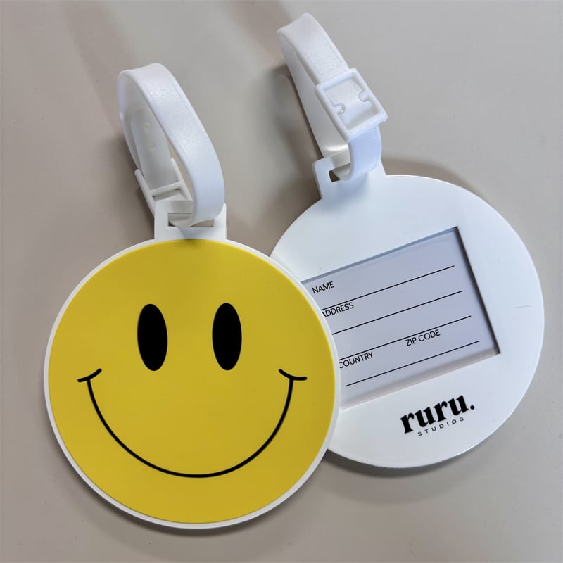
The round yellow tag demonstrates how a familiar expression can become the entire visual identity. The design uses only a yellow field, two black eyes and a curved smile, but it remains immediately recognizable.
Simplicity is particularly effective for travel accessories because luggage is normally viewed from a distance. A tag should not depend entirely on small text or detailed artwork to stand out.
When developing the main concept, ask:
- Can the tag be recognized from several feet away?
- Is there one obvious focal point?
- Does the design work without additional explanation?
- Is it visually different from the suitcase or bag?
- Will the idea remain clear when the tag is moving?
2. Balance the Front and Back
The two sides of a luggage tag serve different visual purposes.
The front is generally the expressive side. It may contain an illustration, emblem, logo, character, pattern or message. The back is more functional and may contain an identification window or fields for contact information.
A successful design connects the two sides without forcing them to look identical.
In the round example, the front uses a large yellow graphic while the back changes to white and reserves most of the surface for an information card. The consistent circular shape and white outer edge keep both sides visually connected.
A useful front-and-back structure is:
Front
- Strong visual identity
- High color contrast
- Limited wording
- Recognizable symbol
- Clear composition
Back
- Organized information area
- Readable field labels
- Enough writing space
- Controlled branding
- Strong contrast between text and background
The back should not feel like an afterthought. It is part of the overall product experience and should follow the same visual system as the front.
3. Use Color for Fast Bag Recognition
Color is one of the fastest ways to distinguish a suitcase on a baggage carousel.
Bright yellow, lime green, turquoise, orange and red can create immediate visibility. Dark navy, black and deep blue can also be effective when combined with white or bright accent colors.
The most successful color combinations usually include:
- One dominant background color
- One contrasting text or outline color
- One or two supporting accent colors
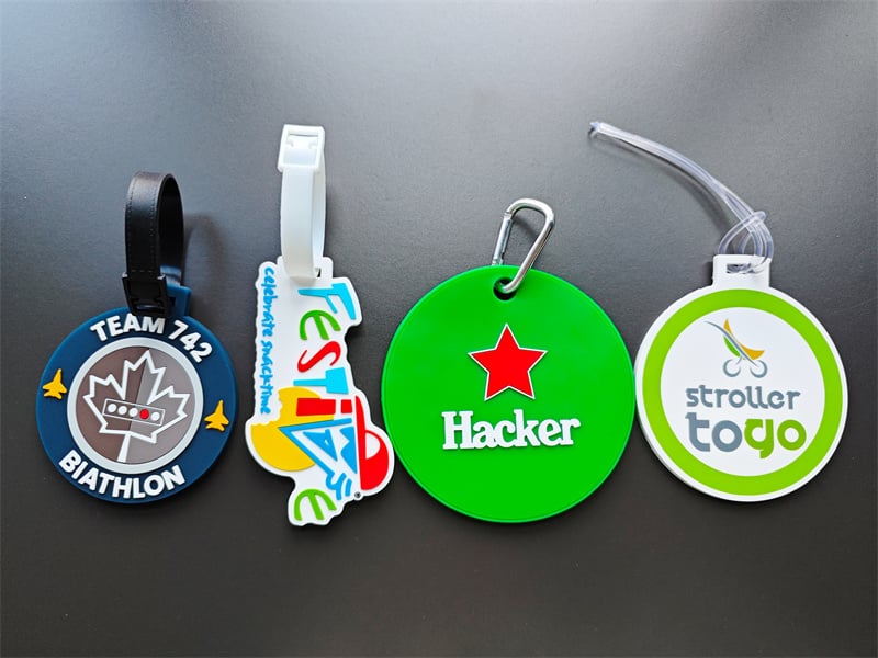
The green circular tag uses a red star and white lettering to create a clear focal point. The colors are simple, but the contrast makes the design easy to identify.
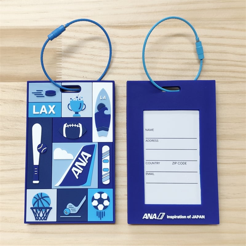
The sports-inspired rectangular design uses several shades of blue. Instead of appearing monotonous, the palette creates depth through alternating light and dark blocks.
Color can also communicate personality:
- Yellow feels cheerful and energetic.
- Blue suggests travel, technology and reliability.
- Green feels active, fresh and highly visible.
- Black creates a modern and professional impression.
- Red adds urgency and visual energy.
- White provides clarity and space.
The background color of the suitcase should also be considered. A dark tag may disappear against black luggage, while a light or brightly colored design will usually be easier to locate.
4. Turn Typography Into a Dimensional Feature
Text does not have to remain flat. On a PVC luggage tag, lettering can become a physical part of the composition.
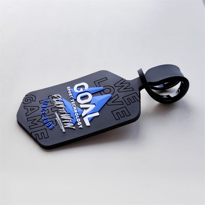
The technology-themed tag uses white, blue and gray lettering at different heights. The raised elements create shadows, helping the central wording stand out against the matte black base.
This layered approach creates hierarchy:
- The largest letters communicate the primary identity.
- Smaller text provides supporting information.
- Recessed background lettering adds texture without competing for attention.
- Blue geometric forms guide the eye toward the center.
For effective luggage tag typography:
- Keep important words large.
- Use bold, readable letterforms.
- Avoid placing long sentences in a small space.
- Create contrast between primary and secondary text.
- Use spacing to prevent letters from merging.
- Let raised text highlight only the most important message.
Background lettering can add visual interest, but it should remain quieter than the main text. If every word uses the same height, color and size, the design will lose hierarchy.
5. Build Visual Interest With Raised and Recessed Layers
PVC allows designers to use physical depth rather than relying entirely on printed effects.
A design may include:
- Raised letters
- Recessed backgrounds
- Layered icons
- Framed information areas
- Dimensional borders
- Embossed patterns
- Flat and raised color sections
The black technology tag demonstrates how recessed lettering can create a subtle background pattern, while the main letters and blue shapes sit above the surface.
This is especially useful for designs with a limited color palette. Even when most of the tag is black, differences in depth prevent the surface from looking empty.
Depth should support the hierarchy of the design. The highest elements naturally attract attention, so they should represent the most important words, images or symbols.
6. Use a Modular Grid for Storytelling
A luggage tag can also communicate a story through a group of small illustrations.
The blue rectangular tag uses a modular grid containing sports equipment, travel references and graphic symbols. Each block carries an individual idea, while the shared color palette unifies the full composition.
This grid approach works well for themes with several related subjects, such as:
- Travel destinations
- Local landmarks
- Sports activities
- School programs
- Company services
- Event highlights
- Cultural symbols
- Transportation icons
To keep a modular design organized:
- Use consistent line thickness.
- Repeat a limited color palette.
- Vary the size of the grid sections.
- Leave enough space around each icon.
- Include one or two larger focal blocks.
- Avoid giving every illustration equal visual weight.
The larger airplane-tail graphic anchors the composition, while the smaller sports icons provide supporting detail. This keeps the design from feeling like a random collection of symbols.
7. Choose a Shape That Supports the Message
Round and rectangular luggage tags are visually stable and provide useful space for identification information. However, an irregular outline can create a stronger association with a word, logo or theme.
The collection shown here includes circular tags, a rectangular tag and a vertically arranged letter-shaped design.
Different shapes communicate different design qualities:
- Circle: Friendly, balanced and easy to recognize
- Rectangle: Organized, functional and suitable for longer information fields
- Oval: Soft and streamlined
- Letter shape: Expressive and brand-focused
- Object silhouette: Playful and memorable
- Shield or badge: Structured and official
The shape should not make the product difficult to use. Very thin extensions, narrow cutouts and sharp projections may look attractive in artwork but can make the tag visually fragile or awkward when attached to luggage.
A strong irregular shape usually has a compact silhouette with clearly recognizable proportions.
8. Treat the Attachment as Part of the Design
The strap or cable is not only a functional component. Its color, thickness and shape affect the overall appearance.
The product examples show several attachment styles:
- Flexible buckle straps
- Clear loop straps
- Colored wire cables
- Small metal carabiners
- Dark straps coordinated with the tag
A white strap makes the yellow smile tag feel light and playful. The blue wire cable visually connects with the blue sports design. A black strap blends naturally with darker, professional-looking tags.
When selecting an attachment style from a design perspective, consider:
- Does its color support the main palette?
- Is it visually proportional to the tag?
- Does it suit the intended audience?
- Does it make the design feel sporty, casual or professional?
- Will it visually compete with the tag?
Matching the attachment to the artwork can make the product feel more complete.
9. Make the Information Area Easy to Use
The information side should prioritize clarity.
Common fields may include:
- Name
- Phone number
- Address
- Country
- ZIP or postal code
Not every tag needs every field. Too many lines can make the back appear crowded and may encourage travelers to display more personal information than necessary.
A clean information layout should use:
- Short, recognizable labels
- Strong alignment
- Comfortable line spacing
- A clear writing area
- Dark text on a light background
- A visible frame or window
The rectangular blue tag uses a large vertical information area, while the round smile design uses a compact inset card. Both solutions work because their layouts follow the available shape.
The form should be designed specifically for the tag rather than reduced from a full-size document.
10. Create a Consistent Series With Controlled Variation
A luggage tag collection can include different colors, symbols or shapes while maintaining a shared visual identity.
Consistency may come from:
- A repeated border
- The same typography
- A shared color family
- Similar attachment hardware
- Matching information-card layouts
- Repeated line thickness
- Related visual themes
Variation can then be introduced through:
- Different main colors
- Individual icons
- Names or team numbers
- Destination graphics
- Sport symbols
- Alternate silhouettes
This approach is useful when designing for teams, events, employee groups, travel programs or product collections. Each tag can be recognizable as part of the same family without looking identical.
11. Design for Movement and Real Travel Conditions
A luggage tag is rarely viewed in a perfectly controlled setting. It hangs from a moving bag, turns over, overlaps other straps and may be seen under different lighting.
For that reason, the design should remain effective when:
- Viewed from an angle
- Partially covered
- Moving on a baggage carousel
- Seen under bright or dim lighting
- Placed against a patterned suitcase
- Viewed from several feet away
Large shapes, strong contrast and short wording usually perform better than delicate details.
A useful test is to reduce the design on screen and glance at it for only one or two seconds. If the main idea is still visible, the visual hierarchy is probably working.
Final Thoughts
Good PVC luggage tag design combines visual personality with practical organization.
The front should create recognition through color, shape, illustration or typography. The back should present information clearly. Depth can add emphasis, while a coordinated strap or cable completes the appearance.
The most effective luggage tags are not simply small advertisements attached to a suitcase. They are compact design objects that help travelers identify their bags while expressing a brand, group, destination or personal style.


